

The 2025 web design trends are reshaping how websites look and feel, setting the stage for what your site needs to succeed in 2026. This recap is for web designers, developers, and business owners who want to stay ahead of the curve and create websites that grab attention and keep visitors engaged.
Five major website design trends for 2026 are already gaining momentum. You’ll discover how bold typography design and experimental text layouts are breaking traditional rules to create memorable brand experiences. We’ll explore immersive 3D web design and spatial design elements that transform flat screens into interactive worlds. You’ll also learn about sustainable web design principles that reduce environmental impact while improving performance, plus how AI personalization web design creates dynamic content that adapts to each user in real-time.
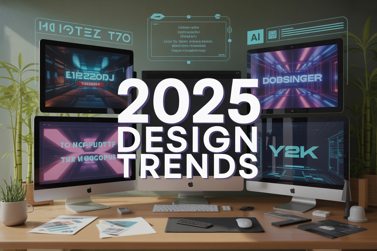
The retro-futurism design movement is bringing back Y2K revival aesthetics with a modern twist, proving that sometimes looking back helps us move forward. These modern website design trends aren’t just visual updates – they’re fundamental shifts in how we think about user experience and digital storytelling.
Bold Typography and Experimental Text Layouts
Oversized Headlines That Command Attention
The era of subtle, understated headlines is officially over. Two thousand twenty-five web design trends are pushing typography to unprecedented scales, with designers embracing headlines that dominate entire viewport sections. These massive text treatments aren’t just about size—they’re about creating immediate emotional impact and establishing brand personality within seconds of page load.
Modern websites are treating their primary headlines like architectural elements, allowing typography to take center stage rather than supporting imagery. This approach creates instant hierarchy and forces visitors to engage with your core message before anything else. Brands like Apple and Nike have pioneered this approach, but now it is being adopted across industries, from tech startups to luxury fashion houses.
The key lies in striking a balance between proportion and readability. Designers are experimenting with font weights, letter spacing, and creative line breaks to ensure these oversized elements enhance rather than overwhelm the user experience.
Mixed Font Pairings for Dynamic Visual Hierarchy
Gone are the days of playing it safe with single font families. Bold typography design now embraces unexpected combinations that create visual tension and interest. Designers are pairing serif headlines with sans-serif body text, mixing condensed and expanded typefaces, and even incorporating script fonts for accent elements.
This mixing creates natural reading rhythms that guide users through content hierarchies, facilitating a seamless reading experience. A bold, geometric headline might pair with a more traditional serif for body text, creating contrast that keeps readers engaged. The trick is finding fonts with complementary characteristics—similar x-heights, compatible mood, or contrasting weights that enhance rather than clash.
Successful mixed pairings often include a maximum of three font families, with each serving a specific purpose: headline impact, subheading clarity, and body text readability. This approach enables brands to convey their personality while maintaining professional credibility.
Text as Art: Creative Typography Integration
Typography is breaking free from traditional constraints and becoming a genuine artistic expression. Designers are treating individual letters and words as graphic elements, incorporating them into illustrations, animations, and interactive layouts. Letters morph into shapes, words follow curved paths, and entire paragraphs become visual patterns.
This artistic approach works particularly well for creative agencies, fashion brands, and entertainment companies where visual impact matters as much as message clarity. Text becomes an integral part of the brand’s visual identity, creating memorable experiences that linger with users long after they leave the site.
Experimental text layouts include text that follows organic shapes, words that break across multiple colored backgrounds, and typography that interacts with photographic elements. The goal is to make text an integral part of the design rather than simply overlaying it on top.
Interactive Text Elements That Respond to User Actions
Static text is becoming a relic of the past as interactive typography takes center stage. Hover effects reveal hidden words, scroll actions trigger text animations, and click events transform headlines into completely different messages. This interactivity transforms passive reading into active exploration.
These interactive elements range from subtle hover color changes to complex animations where letters reassemble themselves or reveal hidden layers of meaning. Some websites feature text that responds to mouse movement, creating a playful connection between user action and the revelation of content.
The most effective interactive text serves a purpose beyond novelty—it guides users through the site, provides feedback for actions, or reveals additional information progressively. This approach keeps visitors engaged while creating memorable moments that encourage sharing and return visits.
Immersive 3D and Spatial Design Elements
Depth-Creating Layered Compositions
Modern web design is evolving beyond flat interfaces into rich, dimensional experiences that make users feel as though they’re stepping into a digital world. Immersive 3D web design achieves this through carefully orchestrated layers that create genuine depth perception. Think of it like looking through a window rather than at a picture frame.
The secret lies in strategic positioning along the z-axis. Foreground elements cast subtle shadows over mid-ground content, while background components blur slightly to mimic the natural depth of field. Colors shift temperature from warm foreground tones to cooler background hues, mimicking atmospheric perspective. This isn’t just eye candy – it guides user attention naturally through the interface hierarchy.
Innovative designers are combining CSS transforms, WebGL, and Three.js to create these spatial design elements without sacrificing performance. Loading times stay snappy because the depth effect relies more on clever positioning and visual tricks than heavy 3D models. The result feels sophisticated yet accessible across different devices and connection speeds.
Interactive 3D Objects and Navigation
Website navigation is breaking free from traditional menu bars and embracing three-dimensional interactions. Users can now rotate product models, spin through portfolio pieces, or navigate site sections by manipulating floating interface elements in virtual space.
These interactions feel surprisingly natural because they mirror real-world physics. A navigation cube rotates with realistic momentum when users drag it. Portfolio items respond to mouse movements with subtle parallax shifts. Product showcases let customers examine items from every angle, reducing uncertainty and boosting purchase confidence.
The technical implementation combines WebGL rendering with intuitive gesture controls. Touch devices respond to pinch, rotate, and swipe gestures, while desktop users get precise mouse control. Progressive enhancement ensures the experience degrades gracefully – users with older browsers still get functional navigation, just without the 3D flourishes.
Parallax Scrolling for Enhanced User Engagement
Parallax scrolling has evolved from a simple background image movement to a sophisticated storytelling tool. Two thousand twenty-five web design trends showcase parallax, which creates a narrative flow where different scroll speeds reveal information progressively and build an emotional connection with the content.
The best implementations feel cinematic. As users scroll, foreground text moves quickly while background imagery crawls slowly, creating the illusion of traveling through space. Intermediate layers move at varying speeds, adding complexity without chaos. This technique works exceptionally well for brand storytelling, product launches, and case study presentations.
Performance optimization makes modern parallax possible on mobile devices. CSS transforms handle the heavy lifting, while JavaScript manages the scroll calculations efficiently. Reduced motion preferences disable effects for users who need them, ensuring accessibility remains paramount while delivering stunning experiences for everyone else.
Sustainable and Eco-Conscious Design Principles
Minimalist Aesthetics That Reduce Digital Footprint
Website designers are embracing clean, minimal layouts that strip away unnecessary elements, creating faster-loading sites with smaller carbon footprints. This movement extends beyond visual appeal – fewer graphics, streamlined code, and optimized images result in reduced server loads and lower energy consumption. Modern sustainable web design principles prioritize white space as a design element, rather than filling every pixel with content or animations.
The “less is more” philosophy is evident in single-column layouts, simplified navigation menus, and a purposeful content hierarchy. Designers are removing heavy JavaScript libraries, excessive plugins, and autoplay videos that drain bandwidth. These eco-conscious website design choices deliver better user experiences while consuming less digital energy across hosting servers and user devices.
Earth-Tone Color Palettes and Natural Textures
Color schemes inspired by nature dominate 2025 web design trends, featuring warm terracotta, sage green, dusty rose, and sandy beige palettes. These colors create calming, organic experiences that foster a connection with environmental consciousness. Designers pair these hues with subtle textures that resemble wood grain, stone surfaces, and organic patterns, suggesting natural materials without requiring resource-intensive graphics.
These earth-toned interfaces often incorporate subtle gradients mimicking sunsets or forest canopies, creating depth without relying on heavy visual effects. The color psychology behind these choices reinforces brand values around sustainability, authenticity, and environmental responsibility, making websites feel more human and approachable.
Green Hosting and Performance-Optimized Design
Performance optimization has become central to sustainable web design principles, with designers prioritizing renewable energy-powered hosting solutions and carbon-neutral server infrastructure. Websites built with sustainability in mind feature compressed images, efficient CSS frameworks, and minimal HTTP requests that reduce server processing power.
Design decisions now consider energy consumption at every level – from choosing lightweight fonts to implementing lazy loading for images and videos. Content delivery networks powered by renewable energy sources are becoming standard, while designers optimize for mobile-first experiences that consume less data and battery power on user devices.
Transparency in Environmental Impact Communication
Websites increasingly display their environmental credentials through carbon footprint calculators, sustainability reports, and real-time energy usage displays. This transparency trend involves showing users how their browsing behavior impacts energy consumption and offering eco-friendly alternatives, such as dark mode toggles or low-bandwidth viewing options.
Companies embed environmental impact statements directly into their design interfaces, creating accountability and encouraging conscious digital consumption. These features transform websites from passive information sources into active participants in environmental awareness campaigns.
AI-Enhanced Personalization and Dynamic Content
Adaptive Layouts Based on User Behavior
Modern websites are getting more thoughtful about how they present themselves to different visitors. AI personalization web design now tracks user interactions in real-time, analyzing everything from scroll patterns to click heat maps. When someone repeatedly hovers over product images but skips text descriptions, the AI adjusts the layout to feature larger visuals and condensed copy. Mobile users who prefer quick swipes get streamlined single-column designs, while desktop users who take their time see expanded layouts with detailed information panels.
The technology goes beyond simple responsive design. Intelligent algorithms detect user preferences for navigation styles, content density, and interaction patterns. A user who consistently uses keyboard shortcuts gets a different interface than someone who relies on mouse clicks. These dynamic content trends are reshaping how designers approach user experience, transitioning from one-size-fits-all approaches to truly individualized digital environments.
Real-Time Content Customization
Content personalization has evolved from basic demographic targeting to sophisticated behavioral prediction. AI systems now analyze browsing history, time spent on pages, and engagement patterns to serve relevant content blocks instantly. A returning visitor interested in sustainability topics sees eco-friendly product recommendations and green initiative content automatically prioritized on the homepage.
This real-time customization extends to the selection of multimedia content. Video thumbnails, image choices, and even text tone adapt based on user preferences. Someone who engages more with casual, conversational content gets a different voice than a user who prefers technical specifications. The personalization engine continuously learns and refines its understanding of each visitor, creating unique experiences that feel natural rather than robotic.
Intelligent Color Scheme Adjustments
Color psychology meets machine learning in this emerging trend. AI systems analyze user behavior data to determine optimal color schemes for individual visitors. Users who spend more time on pages with warmer color palettes might see the site automatically adjust to display more oranges and reds in their interface elements.
The system considers factors like time of day, device type, and user location to make these adjustments. Night-time browsers get softer, darker themes to reduce eye strain, while daytime users see brighter, more energetic color combinations. Accessibility preferences are also integrated, with the AI detecting users who might benefit from higher contrast ratios or specific color combinations based on their interaction patterns.
Predictive Interface Elements
The most advanced AI-enhanced personalization systems anticipate user needs before they’re expressed. Predictive interface elements appear based on behavioral patterns and contextual clues. A user who regularly downloads resources might see download buttons appear more prominently, while someone who frequently shares content gets enhanced social sharing options.
Bright search bars expand with suggested queries based on browsing history and current page context. Navigation menus reorganize themselves to surface the most relevant sections for each user. Call-to-action buttons adjust their messaging and positioning according to where users are in their customer journey. These predictive elements create smoother user experiences by reducing the cognitive load required to find desired information or complete tasks.
Retro-Futurism and Y2K Revival Aesthetics
Chrome Effects and Metallic Finishes
Metallic surfaces are taking center stage in 2025 web design trends, bringing that unmistakable Y2K nostalgia to modern websites. Chrome effects create depth and sophistication that flat design can’t match. Think brushed aluminum backgrounds, polished silver navigation bars, and glossy metallic buttons that catch virtual light in ways that make users want to reach out and touch them.
The key to pulling off chrome effects lies in subtlety and strategic placement. Rather than overwhelming entire pages with metallic finishes, innovative designers are using them as accent elements – perhaps on call-to-action buttons, logo treatments, or section dividers. CSS gradients paired with careful shadow work can create convincing metallic textures that load quickly and scale beautifully across devices.
What makes this trend particularly exciting is how it bridges the gap between nostalgia and innovation. Modern browsers now support advanced CSS properties that enable the creation of realistic metallic effects without relying on heavy image files or complex animations that slow down page load times.
Holographic Elements and Iridescent Colors
Holographic design elements bring that magical, shifting quality that defined early 2000s aesthetics while leveraging today’s advanced web technologies. These Y2K revival aesthetics manifest through color-shifting backgrounds, iridescent text effects, and prismatic overlays that change as users scroll or hover.
CSS blend modes and sophisticated gradient techniques allow designers to create surfaces that appear to shift through multiple colors simultaneously. Think rainbow gradients that transition from deep purples to electric blues, creating that signature holographic shimmer we associate with old CD-ROMs and early digital culture.
The technical execution involves layering multiple gradients with different opacity levels and animation timings. When done right, these effects create mesmerizing visual experiences that capture attention without being overwhelming. Popular implementations include holographic navigation elements, iridescent hero sections, and color-shifting typography that responds to user interaction.
Progressive web apps are particularly well-suited for these effects because they can leverage device capabilities, such as gyroscope data, to create truly interactive holographic experiences that respond to how users physically move their devices.
Pixelated Graphics Meet Modern Technology
The marriage of pixelated aesthetics with contemporary web capabilities represents one of the most intriguing aspects of retro-futurism design. Pixel art isn’t just making a comeback – it’s being reimagined through modern techniques that maintain that chunky, nostalgic feel while delivering crisp performance on today’s high-resolution displays.
SVG-based pixel art scales perfectly across all screen sizes while maintaining those characteristic sharp edges. Designers are creating entire icon systems using pixelated styles, complete with subtle animations that bring 8-bit characters to life through CSS transforms and transitions. These elements work particularly well for tech startups, gaming companies, and creative agencies looking to establish a playful yet sophisticated brand presence.
What’s particularly clever about modern website design trends incorporating pixel art is how they’re being combined with smooth, modern UI elements. You might see a pixelated mascot character alongside sleek typography and contemporary layout grids, creating a delightful contrast that feels both nostalgic and forward-thinking.
Interactive pixel art elements are becoming increasingly popular, with users able to hover over pixelated graphics to trigger micro-animations or color changes. This approach transforms static retro elements into engaging, dynamic components that enhance user experience while maintaining that distinctive old-school digital aesthetic.
The design landscape of 2025 has brought us exciting new ways to connect with audiences through bold typography that breaks traditional boundaries, immersive 3D experiences that make websites feel alive, and eco-conscious choices that reflect our values. We’ve also seen AI step up to create personalized experiences that genuinely resonate with individual users. At the same time, nostalgic retro-futurism has given us permission to play with the past and the future simultaneously.
These trends aren’t just pretty faces – they’re tools that can transform how your audience experiences your brand online. Start experimenting with one or two of these movements that align with your brand’s personality and goals. Your 2026 website doesn’t have to incorporate every trend, but embracing the ones that resonate with your vision will help you stay ahead of the curve and create memorable digital experiences that your visitors won’t forget.
Adapting modern Design Movements to your digital strategy ensures your site stays relevant, functional, and visually compelling. Whether you’re enhancing usability with Post & Page Management, extending flexibility through Elementor Support, or driving conversions via Sales Lead Generation, each choice shapes how users experience your brand. Discover how evolving design principles can elevate your digital presence in our Design Movements hub.


