

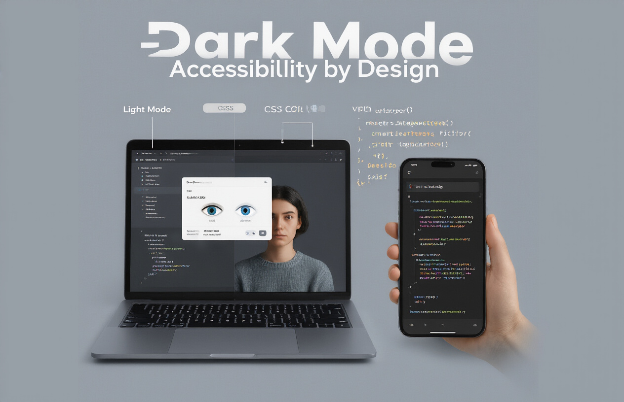
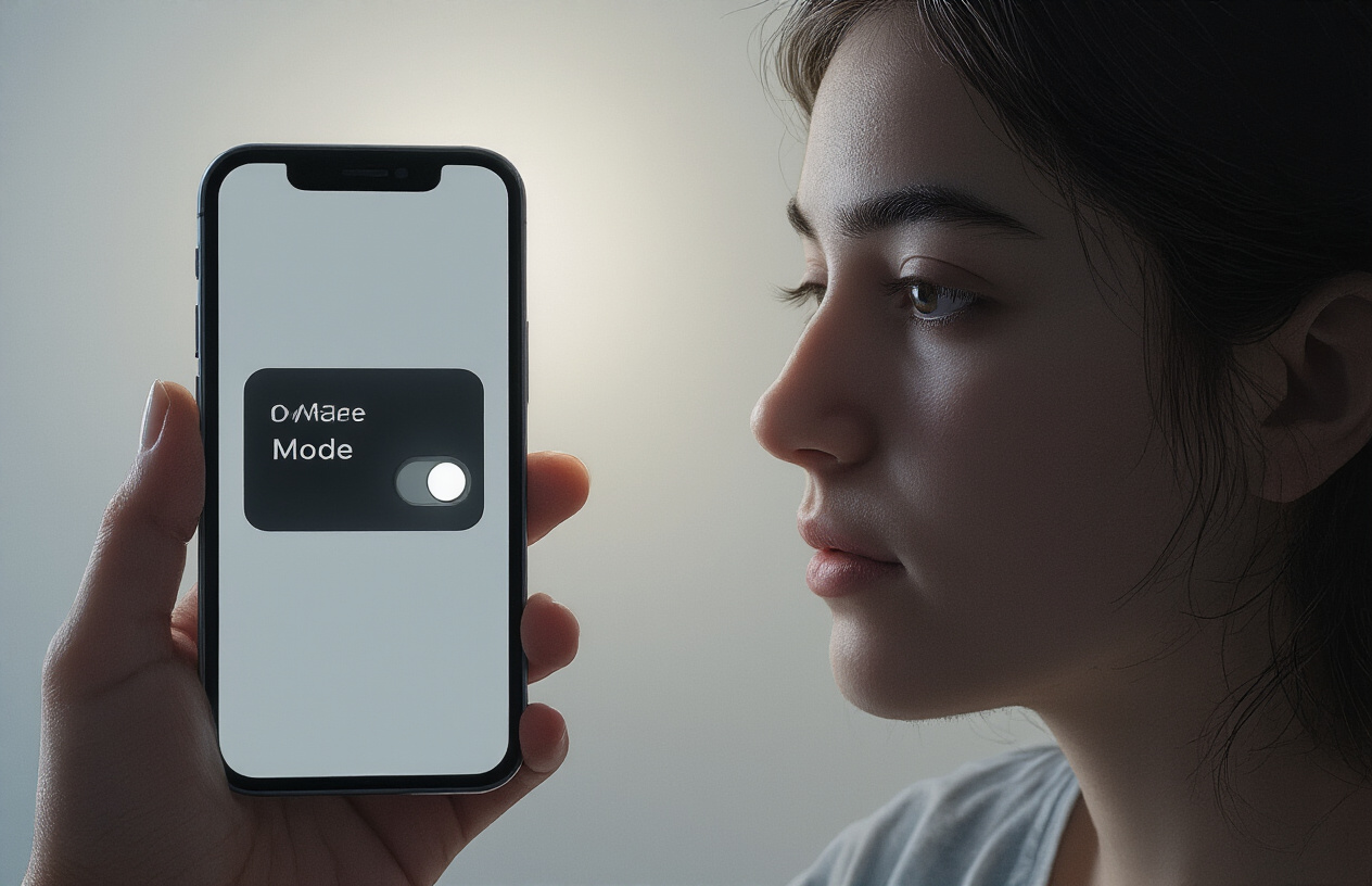
Ever opened a new app and been blasted with searing white light at 11 PM? Your retinas scream in protest. You’re not alone – 81% of users prefer dark mode when available, and not just for the aesthetic.
Designing for dark mode isn’t just trendy – it’s becoming the expected default. But creating accessible themes that work when users toggle between light and dark presents unique challenges for designers and developers.
In this guide, we’ll explore dark mode implementation best practices that maintain accessibility standards without sacrificing your brand identity, from color contrast calculations to handling user preferences programmatically.
But here’s the question keeping design teams up at night: how do you create a cohesive experience that works in both worlds when you can’t control which one your user prefers?
Understanding Dark Mode: Benefits Beyond Aesthetics
Eye strain reduction in low-light environments
Dark mode isn’t just a stylish trend – it’s saving your eyes when you’re scrolling through your phone at midnight. The bright white backgrounds of traditional interfaces can feel like staring directly into a flashlight in dark environments. Your pupils dilate in low light, making that sudden blast of brightness particularly jarring.
What happens when you switch to dark mode? The screen emits significantly less light overall, creating a more comfortable viewing experience that matches your surroundings. Users report up to 30% less eye fatigue when using dark themes during nighttime browsing sessions.
But don’t take my word for it. Try this quick test: switch between light and dark modes on your phone tonight before bed. Notice how much more comfortable the darker interface feels. Your eyes will thank you.
Battery consumption advantages of OLED screens
Got an OLED screen? Dark mode is your battery’s best friend.
Unlike LCDs, OLED screens light up individual pixels rather than using a backlight. When displaying black pixels, those pixels are turned completely off, consuming zero power. The darker your interface, the less power your screen uses.
Real-world tests show impressive results:
- Google foundthatt ark mode on YouTube can slash battery usage by up to 60%
- Dark themes on phones can extend battery life by 2-3 hours of typical use
- Even mixed dark/light interfaces see 15-20% power savings
Accessibility benefits for light-sensitive users
For people with photophobia, light sensitivity, or specific visual impairments, dark mode isn’t optional – it’s essential.
Bright screens can trigger migraines, eye pain, and visual disturbances for users with conditions like:
- Dry eye syndrome
- Post-concussion syndrome
- Irlen Syndrome, Specific forms of macular degeneration
These users often rely on dark mode to access digital content that would otherwise be completely inaccessible. When you design with dark mode in mind, you’re not just adding a feature – you’re removing barriers.
Growing user preference statistics
The numbers don’t lie – dark mode is increasingly becoming the default choice for many users:
- 81.9% of users choose dark mode when given the option
- 95% of developers report that user demand for dark themes has increased
- Mobile dark mode usage jumps to 91.8% during evening hours
- 64.6% of users cite “easier on the eyes” as their primary reason for choosing dark mode
This isn’t just a fad. Dark mode represents a fundamental shift in how users interact with technology across different environments and times of day.
Dark Mode Design Principles
A. Color contrast ratios for WCAG compliance
Dark mode isn’t just about looks—it’s about making sure everyone can use your site. The Web Content Accessibility Guidelines (WCAG) don’t change just because you switched the lights off. You still need a contrast ratio of at least 4.5:1 for standard text and 3:1 for large text.
The tricky part? Colors that work perfectly in light mode often fail miserably in dark mode. That vibrant blue button might pop beautifully on white but disappear into the void on black.
I’ve seen too many dark themes where designers just inverted colors and called it a day—bad move. You need to test and adjust each color combination specifically.
Quick tip: don’t use pure black (#000000) backgrounds with pure white (#FFFFFF) text. The contrast is too harsh and causes eye strain. Try a dark gray background (#121212 or #1E1E1E) with slightly off-white text (#F0F0F0) instead.
B. Typography considerations for readability
Typography gets weird in dark mode. Text that looks crisp in light mode can appear bloated and fuzzy when viewed in dark mode.
Here’s what happens: light text on dark backgrounds visually appears to “bleed” into the dark space around it. It’s called the halation effect.
To fix this:
- Slightly decrease font weight in dark mode
- Increase letter spacing by 0.05em to 0.1em
- Consider using sans-serif fonts, which maintain readability better in dark mode
Font sizes that work in light mode might need adjustment, too. A 16px font might need to be 18px in dark mode to maintain the same perceived size.
C. Interactive element visibility challenges
Dark mode reveals all your lazy design shortcuts. Those subtle hover states that worked fine in light mode? They’re practically invisible now.
Interactive elements need extra attention in dark mode:
- Buttons need distinct borders or shadow effects
- Form fields require clear boundaries
- Focus states must be more pronounced
- Hover effects need stronger visual feedback
I’ve clicked around too many dark interfaces, wondering if this is even a button?” Don’t make that mistake.
Some designers add subtle glows around interactive elements in dark mode. This works well, but be careful—too much glow creates that “neon sign” effect that screams just discovered Photoshop effects.”
D. Emotional impacts of dark color schemes
Dark interfaces change how users feel about your product. They create a sense of sophistication and focus, but they can also feel serious, heavy, or dramatic.
Think about your content. A financial dashboard feels right at home in dark mode. A children’s website? Maybe not so much.
Color psychology shifts in dark mode, too. Red becomes more alarming, blue more calming, and green more prominent. You’re not just inverting colors—you’re transforming their emotional impact.
The right dark theme creates a sense of immersion. Users feel like they’re in a focused space, with content that pops forward and UI elements that recede.
The wrong dark theme feels like walking into a dimly lit room where you can’t quite find the light switch.
E. Preserving brand identity in dark interfaces
Your brand wasn’t built for darkness. Those carefully selected colors that perfectly represent your company values? They might look completely different—or worse, invisible—in dark mode.
The mistake many make: forcing brand colors to remain the same. Sometimes you need to adjust hue, saturation, or brightness to maintain the same emotional impact in dark environments.
Create dark mode variants of your primary brand colors that preserve their essence while meeting contrast requirements.
Some elements should remain consistent regardless of mode:
- Logo (consider a light version)
- Primary call-to-action buttons
- Key brand accent colors (adjusted for contrast)
The goal isn’t perfect color matching between modes—it’s consistent brand recognition and emotional response.
Your users should immediately know they’re still on your site, even when the lights go out.
Technical Implementation Strategies
CSS variables for seamless theme switching
CSS variables are a game-changer for implementing dark mode. They let you define colors once and swap them out instantly.
:root {
  --text-color: #333;
  --background-color: #fff;
}

[data-theme="dark"] {
  --text-color: #eee;
  --background-color: #121212;
}

body {
  color: var(--text-color);
  background: var(--background-color);
}
With this setup, switching themes is as simple as changing a single attribute on your root element. No more hunting down every color declaration across your stylesheets!
Respecting user preferences with prefers-color-scheme
Your users have already told their devices whether they prefer dark or light interfaces. Why not listen?
@media (prefers-color-scheme: dark) {
  :root {
    --text-color: #eee;
    --background-color: #121212;
  }
}
This media query automatically applies dark styling when a user has set their system preference to dark mode. It’s the most respectful approach – acknowledging choices they’ve already made.
JavaScript approaches for dynamic theme changes.
Sometimes CSS isn’t enough. You need JavaScript when you want to:
// Toggle between themes
function toggleTheme() {
  const currentTheme = document.documentElement.getAttribute('data-theme');
  const newTheme = currentTheme === 'dark' ? 'light' : 'dark';

  document.documentElement.setAttribute('data-theme', newTheme);
  localStorage.setItem('theme', newTheme);
}
Store their preference in localStorage so it persists between visits. Nothing worse than choosing dark mode only to be blinded on your return!
Testing tools for dark mode accessibility
Dark mode isn’t just about looks – it needs to be accessible too.
- WCAG Color Contrast Analyzer: Verify your text meets AA standards (4.5:1 for normal text)
- Lighthouse: Run accessibility audits directly in Chrome DevTools
- Axe DevTools: Catch contrast issues as you build
- Stark: Plugin for design tools to test color combinations
Test on actual devices with dark mode enabled. Simulators won’t catch everything, especially how your design feels when using it for extended periods.
Common Dark Mode Design Pitfalls

A. Avoiding pure black backgrounds
Ever noticed how your eyes strain when switching from a bright white screen to a pitch-black one? That’s because pure black (#000000) against white text creates excessive contrast that’s harder on the eyes than you’d think.
Intelligent dark mode doesn’t mean going full vampire. Instead, aim for dark grays like #121212 or #1E1E1E. These softer backgrounds reduce the jarring contrast while still giving that dark mode feel users crave.
Most popular apps and sites (YouTube, Twitter, Discord) use these off-blacks for a reason – they’re easier on the eyes during extended viewing sessions.
B. Managing shadow and depth perception
Shadows get weird in dark mode. Those subtle drop shadows that look amazing in light themes? They practically disappear against dark backgrounds.
The trick? Flip your shadow game around. While light themes use dark shadows, dark themes need lighter shadows (often with higher opacity) to create the same depth effect.
Try using lighter shadow colors (like #444444) with a greater blur radius. And sometimes, you’ll need to increase your shadow intensity by 25-30% to achieve the same visual hierarchy that works in light mode.
C. Color distinction challenges in dark palettes
Colors behave differently in the dark. That vibrant blue button? It might look dull and lifeless against a dark background.
Dark mode palettes need higher saturation levels to maintain visual distinction. Your colors need to work harder to stand out.
Some quick fixes:
- Increase the saturation of primary colors
- Boost contrast between UI elements
- Avoid subtle color differences for indicating state changes
- Test with actual users who rely on dark mode
The exact 4.5:1 contrast ratio requirements still apply, but achieving them requires different color choices.
D. Image and media handling strategies
Those perfectly crafted images for light themes often fall flat in dark mode. Transparent PNGs with dark elements? They’ll vanish into your background.
Consider these approaches:
- Add subtle light borders around dark images
- Use CSS filters to adjust brightness/contrast based on the theme
- Create separate image assets for each theme
- Use SVGs with programmatic color fills whenever possible
For photos and videos, avoid automatic inversion – it creates that weird “photo negative” effect nobody wants. Instead, consider slightly reducing the brightness and adding a subtle overlay to make media feel cohesive with your dark theme.
User Experience Considerations

Smooth transitions between light and dark themes
Ever been blinded by a sudden theme change? Yeah, not fun. The key here is animation timing. A good transition takes about 200-300ms—fast enough to feel responsive but slow enough to avoid visual shock.
Don’t just flip colors. Consider using fade transitions between states that ease the visual change. Your users’ eyes will thank you.
.theme-transition {
  transition: background-color 0.3s ease, color 0.3s ease;
}
Persistent user preference storage
Nothing frustrates users more than having to reset their theme preference every single visit. Store these choices in localStorage or cookies to make them stick:
// Save the preference
localStorage.setItem('theme', 'dark');

// Retrieve it later
const userTheme = localStorage.getItem('theme') || 'light';
Even better? Sync preferences across devices using account settings if your platform supports it.
Context-aware theme switching approaches
Intelligent theme switching isn’t just about day and night cycles. Consider:
- Switching based on ambient light sensors
- Changing themes for specific content (like photo galleries)
- Adjusting for battery saving on mobile
Some users want dark mode only for specific activities—reading at night, for example—while preferring light mode during work hours.
System integration best practices
Your app doesn’t exist in a vacuum. Respect the user’s system preferences:
// Check if user has dark mode enabled at OS level
const prefersDark = window.matchMedia('(prefers-color-scheme: dark)').matches;
But always give them the option to override. System preferences should be the default, not the rule.
First-time user education
Don’t hide your theme toggle in some obscure settings menu. When users first arrive, a subtle tooltip or brief introduction to your theme options can make a significant difference.
A simple message like “Prefer dark mode? Toggle here” with an arrow pointing to your switch can boost discovery by 30%.
And please, make your toggle visible and consistent. Users shouldn’t need a treasure map to find it when they need it again.
Designing compelling dark mode experiences requires careful attention to color contrast, typography, and visual hierarchy. As we’ve explored, dark themes offer more than aesthetic appeal—they can reduce eye strain, conserve battery life, and provide critical accessibility benefits for users with visual sensitivities. By following established design principles and implementing proper technical strategies, you can create dark mode themes that enhance usability while avoiding common pitfalls like inverted images and improper contrast ratios.
Remember that user preferences should always guide your approach. While dark mode continues to gain popularity, the best implementations offer seamless transitions between light and dark themes, respecting system settings without compromising on functionality or visual appeal. By prioritizing accessibility and thoughtful design decisions, you’ll create interfaces that work beautifully for all users, regardless of their preferred display mode.
Designing themes that default to dark mode goes beyond surface-level styling—it’s an accessibility imperative. As you craft interfaces optimized for low-light settings, ensure your approach includes scalable design systems and thoughtful token management with Switchpoint’s Custom Plugin Development services and content best practices via our WordPress Content Creation offerings. Whether you’re focused on inclusive front‑end architecture or maintaining consistency across your UI, inclusive dark-theme design requires strategic planning and technical precision. Explore deeper insights into accessible interface design in the Dark Mode resource hub.


